
3 Simple Website Changes to Improve Conversions for Local Businesses

Key Takeaway
Improve one local business service page with a clearer offer, an easier next step, honest proof, and practical checks that separate website actions from qualified leads.
Traffic is not the same as action. And action is not the same as a qualified lead.
A person can visit your service page, tap the phone number, and still never become a good-fit inquiry. That distinction matters. Otherwise, you may "fix" a page based on the wrong signal.
Start smaller than a full redesign or a 40-point conversion audit. Pick one important service page or landing page. Decide what you want the visitor to do. Make three focused changes, test the path, and record what happens next.
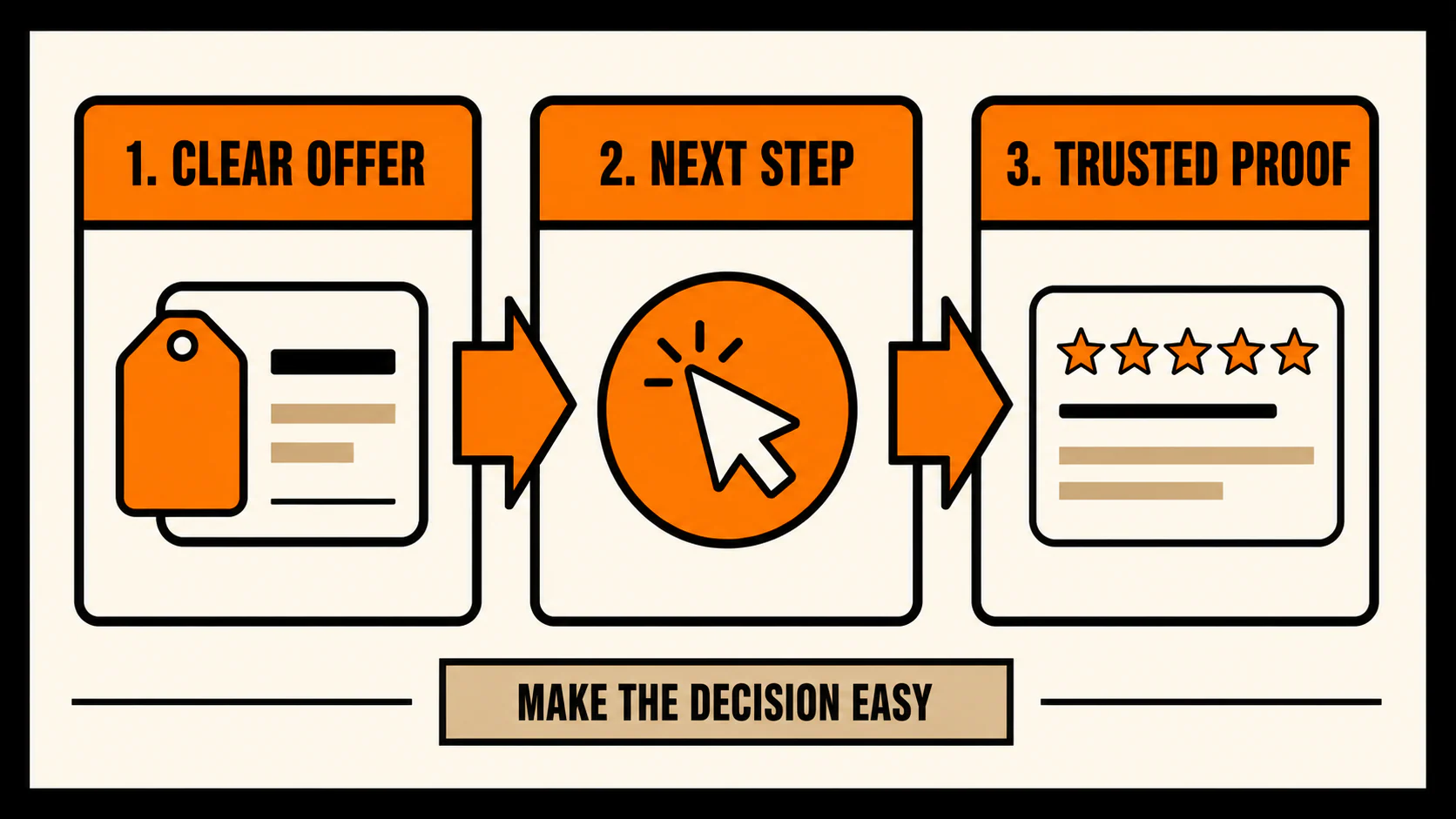
The three changes are straightforward:
- Make the offer and local fit obvious.
- Make the next step specific and easy to complete.
- Put honest proof and decision answers where hesitation happens.
Simple enough. The details below keep you from changing things willy-nilly and hoping for the best.
Before you change the page, define its one job
Do not begin with the entire website. Choose one page that should produce a meaningful action: a call, form submission, consultation request, or appointment request.
Grab a note and write down four things:
- Page: Which service page or landing page are you improving?
- Audience: Who should arrive there, and in what service area?
- Primary website action: What should that person do next?
- Downstream quality signal: How will you know whether that action became a useful inquiry, booked appointment, accepted job, or another business outcome that matters?
Keep the website action and the quality signal separate. Google Analytics 4 can record an important action as a key event. Google's official key-event instructions show how to create an event, mark it as a key event, and verify it in Realtime. That tells you whether the defined website action fired. It does not tell you, by itself, whether the inquiry was qualified or whether anyone booked.
You need a second source for that answer, such as a call disposition, booking record, customer relationship management status, or a simple lead-quality field your team updates consistently.
Before diagnosing the copy, test the current path on desktop and mobile. Tap the phone number. Submit the form with clearly labeled, non-sensitive test data. Open the booking tool. Confirm what happens after each action.
If the path is broken, fix that first. Better button copy cannot rescue a form that never arrives.
You are ready to continue when another team member can name the page, audience, primary action, and quality signal without guessing. If you need a fuller measurement and testing process, use our conversion rate optimization checklist after this quick pass.
Change 1: Make the offer and local fit obvious
Your first useful screen needs to help the right visitor answer four questions:
- What does this business do?
- Is this service meant for someone like me, in my location?
- Why might this offer fit my situation?
- What should I do next?
Pretty design is welcome. Mystery is not.
Consider this clearly hypothetical rewrite for a local HVAC page.
Before:
Comfort you can count on.
After:
Furnace repair for homeowners in Marietta, Georgia. Call to ask about the next available appointment.
The second version will not win a poetry contest. It does not need to. It identifies the service, customer, location, and next step. The actual page can add the reasons to choose the business underneath, provided those reasons are accurate.
Review the headline, supporting copy, and navigation together. Use literal labels such as "Furnace Repair," "Service Areas," and "Contact." Your navigation is a road map, not a place to show off an inside joke. A search bar can help a large or complex site, but it is not a universal cure for unclear menus.
If the message looks clear but the inquiries are wrong
Check whether the traffic source and landing page match before rewriting everything. A page about residential furnace repair cannot satisfy people who arrived looking for commercial installation, a different city, or a do-it-yourself guide.
Inspect the search query, ad, referral, or campaign that sent the visitor when that information is available. The problem may be targeting or page selection rather than the headline.
How to verify this change
Show the page to someone who was not involved in writing it. Without coaching, ask them:
- What service is offered?
- Who and where is it for?
- What would you do next?
Do not explain the page while testing it. The explanation is what you are testing.
Change 2: Make the next step specific and easy to complete
Your call to action has one job: describe the real next step.
"Submit" tells the visitor almost nothing. "Request a Repair Appointment" or "Ask About Availability" sets a clearer expectation, assuming that is what the intake process actually does.
Choose one primary action for the page and keep it consistent. If the headline promises an estimate, the button opens a general contact form, and the confirmation page says someone will call about a consultation, the path has changed names three times before your team has spoken to the person. That is avoidable friction.
Check the entire route:
- Does a phone link open the correct number on mobile?
- Does the form explain what information is required?
- Do validation errors tell the person what needs fixing?
- Does the button work without awkward tapping or horizontal scrolling?
- Does the confirmation state explain what happened and what comes next?
- Does the expected analytics event appear after a safe test?
Forms deserve special attention. The W3C Web Accessibility Initiative's form guidance recommends labels that identify each control and, where possible, explicit association between the label and its field. In plain English: do not rely on placeholder text that disappears as soon as someone starts typing. Keep a visible label such as "Email address" attached to the email field.
That one check does not certify the form as accessible, and it does not guarantee more leads. It removes a common source of ambiguity.
If the action still does not work
Stop evaluating the copy. Repair the phone link, form delivery, validation, confirmation state, booking integration, or analytics setup first. Otherwise, you are judging a message through a broken mechanism.
Then complete the action again on desktop and mobile with non-sensitive test data. Confirm both the visitor-facing result and the internal result. A form success message is useful; a form success message plus the expected inbox, system record, and key event is better.
For phone leads, remember that a tap is only the beginning. Our local-business call audit covers what can happen after the click and how to review that next stage.
Change 3: Put honest proof where hesitation happens
Proof should answer a reasonable doubt. It should not manufacture urgency or ask the visitor to take your word for everything.
The useful proof depends on the decision. It might include:
- an authentic, attributable testimonial;
- relevant credentials, licenses, or certifications you can substantiate;
- a plain-language explanation of the service process;
- the geographic area you actually serve;
- what the visitor should expect after contacting you;
- answers to recurring questions your staff hears from prospects.
Place the proof near the hesitation it resolves. A testimonial about communication may belong beside an appointment request. A service-area statement belongs near the offer. A short process explanation may help before a consultation form. Stuffing every badge, review, and credential into one giant "trust" strip usually makes the visitor do the sorting.
A quick warning before you copy reviews onto the page. The Federal Trade Commission explains that testimonials used on a business's own website are promotional, and its guidance addresses fake or false testimonials, review suppression, and incentives conditioned on sentiment. Google Maps also prohibits practices such as paying for reviews, offering incentives for reviews, selectively requesting positive reviews, or pressuring reviewers to include particular content under its user-contributed content policy.
The rule is simple: do not write, buy, pressure, or misrepresent customer proof. Make sure anything you display is accurate, attributable when appropriate, permitted to use, and relevant to the decision beside it. This is general marketing guidance, not individualized legal advice.
If your proof is thin, do not fabricate reassurance. Improve the customer experience and build a consistent, policy-safe request process instead. Our guide to getting online reviews for your business can help with that work.
How to verify this change
For every proof element, ask:
- Is it accurate now?
- Can we identify where it came from?
- Do we have permission to display it when permission is needed?
- Does it answer a real question at this point on the page?
- Would its wording give a reasonable visitor the wrong impression?
If you cannot answer those questions cleanly, leave the proof off until you can.
Record the change before you judge it
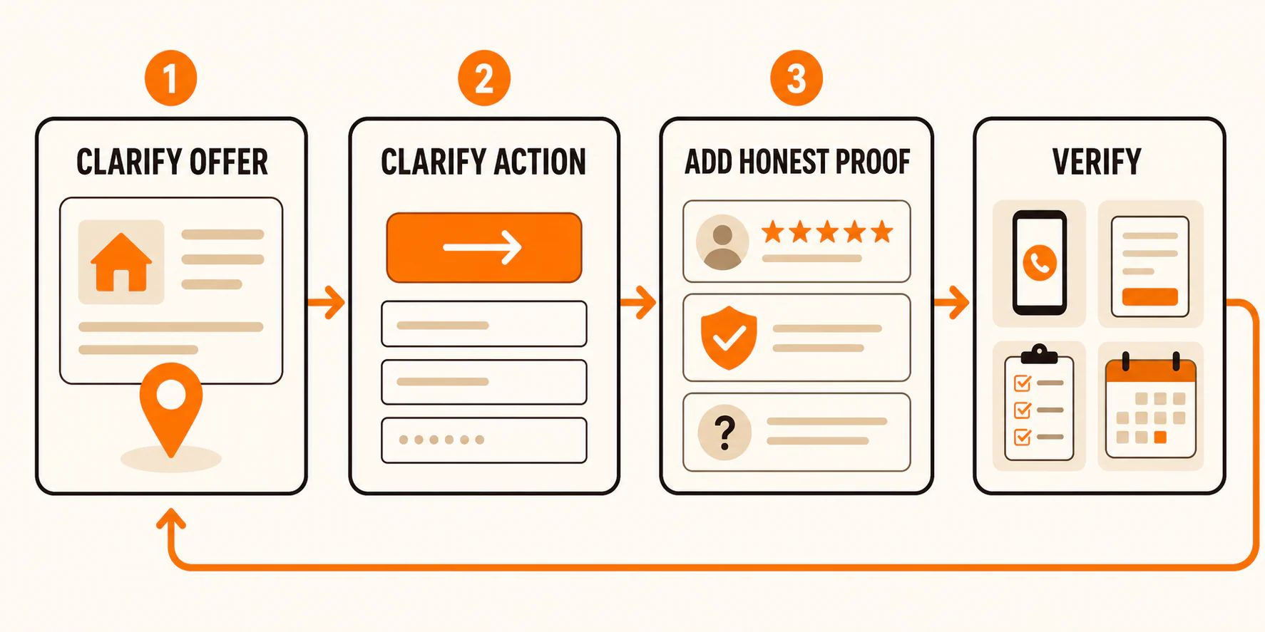
At this point, you have a sequence: clarify the offer, clarify the action, and add honest proof. Now create a record sturdy enough to review later.
Use a change log like this:
| Field | What to record |
|---|---|
| Page | Exact page changed |
| Date | When the change went live |
| Hypothesis | The specific problem the change is meant to address |
| Exact change | What was added, removed, or rewritten |
| Owner | Who is responsible for implementation and review |
| Primary website action | Call, form, booking, or other defined action |
| Quality signal or guardrail | Qualified inquiry, booked appointment, wrong-location lead, spam, or another downstream check |
| Review date | When you will inspect the result |
When attribution matters, change one meaningful element at a time. You can also make one tightly related bundle that you can describe precisely. Rewriting the headline, replacing the form, changing the offer, and launching a new traffic campaign on the same day may be efficient, but it leaves you with a muddy answer about what mattered.
Low-volume local businesses may not have enough activity for a formal A/B test in a practical timeframe. You can still make a bounded review. Confirm that the path works. Compare the defined website action and downstream quality signal before and after the change. Note seasonality, campaign changes, or other factors that may have influenced the result.
Then ask the uncomfortable but useful question: What would weaken this hypothesis?
If you believed the form was too confusing, but safe test submissions work and qualified visitors complete it, the form may not be the main issue. If calls increase while wrong-service inquiries also increase, the website action improved but the traffic or message fit may not have. Keep those unknowns visible instead of forcing a success story.
When these three website changes are not enough
This mini-audit is deliberately small. It will not diagnose every website problem.
Bring in the right specialist when you find broken analytics, complex form or booking integrations, accessibility barriers, unclear traffic intent, or technical problems you cannot verify safely. If the issues extend beyond one conversion path, use the website audit checklist to review the broader site.
If visibility, proof, the website path, and lead follow-up are operating as separate projects, the Local Growth Engine explains how those pieces can work as one system.
For today, pick the page. Write down its one action and one quality signal. Test the current path before you touch the copy. That ten-minute setup will tell you whether you have a messaging problem, a mechanism problem, or simply an unanswered question. Knowing which problem you have makes the next change worth making.
If the answer exposes a technical, analytics, or implementation problem your team cannot resolve, contact YEAH! Local for help after you have documented what you found.
Last updated