

Key Takeaway
Use eight practical homepage conversion checks to clarify your offer, fix contact-path friction, build trust, and measure lead quality.
A polished homepage can still leave a potential customer asking three basic questions: Do they serve my area? Can they solve my problem? What am I supposed to do next?
If the page does not answer those questions, it has a conversion problem. A prettier design will not fix a route that goes nowhere.
Treat the homepage as a routing page. Its job is to help the right visitor understand the offer, trust the business, and take one sensible next step. Before you rewrite a headline or debate button colors, decide where that route should end, then make sure it works.
Work through the checks in order: define the action, test the route, clarify the offer, fix observed friction, then measure what changed. You do not need to rebuild the whole website to start. You do need to stop treating every click or form submission as a business win.

1. Define the conversion and its quality signal
"Get more conversions" is too vague to guide a homepage project. Pick one primary action that matters to the business, such as:
- a submitted contact request;
- a completed appointment or estimate booking;
- a phone call that reaches the business.
Be equally precise about the denominator. If you are evaluating the homepage, compare completed primary actions with the eligible visits that included the homepage. Do not mix sitewide traffic, ad landing-page traffic, and homepage traffic into one rate and pretend the result is easy to interpret.
Then add a quality signal. A form submission is a recorded event. A qualified inquiry, accepted appointment, booked estimate, or sale is a later business outcome. Those are not interchangeable.
A contractor, for example, might track submitted estimate requests as the primary event and qualified estimate requests as the quality guardrail. If submissions rise while spam and out-of-area inquiries rise with them, the page did not necessarily create a better business result.
Google Analytics documents a generate_lead key event based on a confirmation-page view and explains how to check it in the Realtime report. That check confirms analytics activity. It does not tell the business whether the inquiry was qualified or produced revenue. This guide to connecting marketing activity with actual business outcomes goes deeper on that distinction.
2. Test the current contact path before redesigning anything
A broken route outranks a prettier homepage. Test the current experience before touching the design.
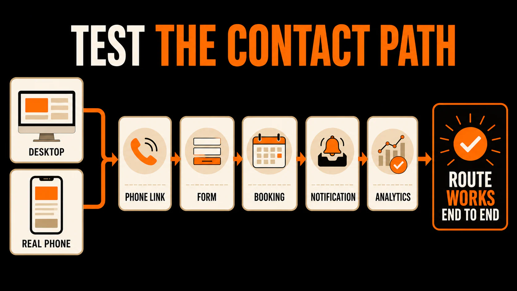
Use a computer and a real phone. Start at the homepage and try every contact method you expect a visitor to use:
- Tap the phone number. Does the correct number open in the dialer?
- Submit the form. Do required fields, error messages, and confirmation behavior work?
- Complete the booking path. Can you reach the final confirmation without getting stuck?
- Check the business side. Did the call, form, or booking alert reach the right person or system?
- Check tracking. Did the expected event appear once, without a duplicate?
Do not stop at a thank-you message. A form can look successful while the notification goes to an old inbox or the inquiry never reaches the system the team uses.
If anything fails, fix it before testing copy, images, or layouts. There is little value in sending more people toward a door that does not open.
3. Make the service, audience, location, and value obvious
The first screen does not need to tell the company's whole story. It needs to help the right visitor answer four questions quickly:
- What does this business do?
- Who does it help, and where?
- Why is it a credible option for this problem?
- What should the visitor do next?
"Quality service you can trust" answers none of them. A useful headline names the service or result in language a customer would recognize. Supporting copy can narrow the service area, type of customer, or situation.
A clear value proposition is good advice, but specificity beats cleverness. "Emergency plumbing for homeowners in North Atlanta" gives a visitor more to work with than "Solutions for life's unexpected moments."
Read the first screen without the logo. If the company could be a plumber, dentist, attorney, or software vendor, the message is doing too little work.
Traffic quality matters here too. If an ad promises one service while the homepage emphasizes another, or the site attracts visitors outside the service area, a homepage rewrite alone will not solve the mismatch. The source, promise, and page need to agree.
4. Give the visitor one specific next step
The primary call to action should tell the visitor what happens after the click. "Submit" describes the button. It does not describe the next step.
Depending on the business, clearer options might include "Request an Estimate," "Check Appointment Availability," or "Call for Emergency Service." These are examples, not magic words. The label has to match the real process on the other side.
A homepage can offer secondary routes, especially when customers have different levels of urgency. A phone call and a request form may both deserve space. The problem starts when every section shouts at the same volume: call, chat, subscribe, download, follow, learn more, and book now.
Choose a primary route. Keep secondary routes visible without letting them overpower it. Then follow the primary action through the rest of the lead funnel so the homepage promise matches the form, booking page, confirmation, and follow-up.
5. Put honest proof where hesitation happens
Proof works hardest when it answers the question a visitor is likely to ask before acting.
For a local-service homepage, useful proof may include current reviews, relevant licenses or credentials, clear process details, original project photos, or a guarantee the business can honor. Use only proof you can support. A row of vague badges or a context-free testimonial is decoration wearing a suit.
Placement matters. A review about punctuality belongs near an estimate or booking decision where timing is a concern. A project example belongs near the service it demonstrates. A credential should sit close to the claim it supports.
Do not invent scarcity, imply certifications the company does not have, or turn one customer's result into a universal promise. One exaggerated claim can undo the reassurance the rest of the page was meant to create.
6. Remove friction only when it is actually friction
Shorter is not automatically better. A form field can slow completion, but it can also help the business screen out poor-fit inquiries or prepare for the first conversation. Ask whether each step earns the effort it demands from the visitor.
Review the form field by field:
- Does the business need this information before the first response?
- Will the visitor understand why it is being requested?
- Can the field wait until a later conversation?
- Would removing it create more work or lower-quality inquiries for the team?
Use the same test for photos and video. Media earns its space when it shows the work, explains a process, answers an objection, or makes the service easier to understand. A large video that slows the page and repeats the headline is not automatically persuasive.
Look for evidence before making a broad cut. Form errors, abandoned booking steps, repeated customer questions, and support feedback can point to real friction. Make one scoped change and watch the primary event alongside the quality guardrail. The longer CRO checklist can help organize a fuller review after the basic route works.
7. Protect the mobile experience and page performance
Testing a narrow browser window is useful, but it is not the same as using the page on a phone. Pick up a real device and try the contact path with your thumb.
Check whether:
- text is readable without zooming;
- phone numbers and buttons are easy to tap;
- sticky banners or chat widgets cover important content;
- form fields use sensible input types and show clear errors;
- the page stays visually stable while images, fonts, and other elements load;
- the primary action remains easy to find after scrolling.
Performance scores need context. Google's Web Vitals guidance covers loading, interactivity, and visual stability, and distinguishes field measurements from lab tests run under controlled conditions. Use both types of measurement to diagnose the page. A better score does not prove that more qualified customers appeared.
If a mobile issue blocks the call, form, or booking route, fix it before debating cosmetic details. The working door comes first.
8. Test one hypothesis and keep a simple change log
"Test everything" sounds ambitious and usually creates a mess. If you change the headline, form, hero image, proof, and button at once, you may see a different result without learning which change mattered.
Write one hypothesis tied to an observed problem. For example: visitors may not realize the company serves their city, so adding the service area beside the primary call to action may change estimate requests from homepage visitors.
Then record the work in a simple table:
| Field | What to record |
|---|---|
| Observed problem | The specific behavior, error, question, or mismatch that prompted the change |
| Proposed change | One scoped update to message, proof, friction, or usability |
| Primary event | The defined homepage action you will count |
| Quality guardrail | The downstream signal that keeps the event honest |
| Start date | When the changed version became available |
| Result and limits | What changed, what did not, and what the available traffic cannot prove |
With enough suitable traffic and a proper experiment setup, an A/B test can compare versions during the same period. If the site does not have enough volume for a conclusive test, use a bounded before-and-after review, note other changes that could affect the result, and call the finding directional. Do not dress a small sample in statistical certainty.
If recorded conversions rise while spam or poor-fit inquiries rise too, keep investigating. The event count improved. The business outcome may not have.
Run the eight checks in order
Start with the route, not the redesign:
- Name one primary homepage action and one quality signal.
- Complete the contact path on desktop and mobile.
- Confirm the service, audience, location, value, and next step are clear.
- Give the visitor one primary call to action.
- Place real proof where hesitation happens.
- Remove friction only when the evidence points to it.
- Fix mobile and performance problems that interfere with the route.
- Test one hypothesis and document what the result can and cannot show.
Now look at the homepage as if you had never seen the business before. Would you know within seconds whether this company could help you and what to do next?
If the answer is no, you have a specific place to start.
Last updated