
How to Improve Your Website Conversion Rate Without More Traffic

Key Takeaway
Find the first leak in your local-service website, fix one thing at a time, and measure calls, forms, lead quality, and booked outcomes without buying more traffic.
Traffic gets a lot of attention in digital marketing. Sometimes too much.
If people already reach your website but don't call, request a quote, or book an appointment, buying more clicks may just send more prospects through the same leaky path. Traffic still matters. But before you pay for another visitor, it's worth figuring out what happens to the visitors you already have.
There's no honest way to promise that a new button, shorter form, or clever headline will double your conversions. The result depends on the page, the offer, the audience, the traffic, and how well everything is measured. Random "conversion hacks" won't fix that uncertainty. A simple diagnosis process will.
Here's the useful version: choose one action that matters, verify that you can track it, find the first meaningful leak, make one controlled change, and judge the result alongside lead quality. That's how you improve your website conversion rate without confusing activity with progress.
1. Decide What Counts as a Conversion
Start with one page and one primary action.
For a local service business, that action might be:
- calling from the website;
- submitting a quote request;
- booking an appointment; or
- completing an eligibility or consultation form.
Pick the action the page is actually built to produce. A service page with a "Request an Estimate" button shouldn't be judged by newsletter signups just because those are easier to count.
Then be careful with the word conversion. A form submission is a website conversion, but it isn't automatically a qualified lead. A qualified lead isn't automatically an appointment. And an appointment isn't automatically a completed job.
That distinction matters because a change can increase form submissions while making the business outcome worse. If a shorter form brings in more spam, wrong-service requests, or people outside your service area, the website number went up while your team got busier sorting junk.
Think of the journey as a conversion ladder:
- A relevant visitor reaches the page.
- The visitor completes the primary website action.
- The inquiry is qualified.
- The prospect books or accepts the next step.
- The work is sold or completed, if you can track that far.
Your website conversion rate usually measures the first handoff, not the whole business result.
Use this plain formula:
Conversion rate = completed primary actions ÷ comparable visits or sessions × 100
Name the denominator and stick with it. Don't calculate one month using users, the next using sessions, and then celebrate the difference. You changed the ruler.
2. Verify the Measurement Before You Fix the Page
There's no point improving a conversion rate you can't trust.
Before touching the design or copy, complete the same path a prospect would use. Do it on a phone and a computer. If calls are the main action, tap the phone number. If forms matter, submit a test lead. If booking matters, move through the calendar until you reach a confirmed appointment or a safe test stopping point.
Check the entire handoff:
- Does the phone number dial the correct business?
- Does the form accept and validate the right information?
- Does the booking flow show the right service, location, and availability?
- Does the visitor receive a clear confirmation?
- Does the submission reach the inbox, CRM, scheduler, or call system used by the team?
- Does analytics record the completed action once, rather than zero times or several times?
Google Analytics calls an action that matters to the business a key event. That terminology is useful, but the software can't decide which action matters for your business. You still have to define it and test it.
This first check catches an embarrassingly common class of problems: the page may be fine while the phone link, form notification, confirmation screen, or analytics event is broken. Rewriting the headline won't fix a lead that never reaches the business.
You're done with this step when you can complete the primary action yourself, see the expected confirmation, verify that the business receives it, and find the event in the reporting system.
3. Find the First Meaningful Leak
Now resist the urge to change everything.
You're looking for the earliest handoff you can't explain. That might be the gap between an ad and a service page, between the page and the contact action, or between a form submission and the team's follow-up.
Use the evidence you have. Analytics can show where visitors leave. Call recordings or dispositions can show whether inquiries are relevant. Form errors can expose a technical problem. A careful mobile walkthrough can reveal that the button is hidden, the form is miserable to complete, or the page answers the wrong question.
This table gives you a starting point without pretending that a symptom proves the cause:
| What you observe | What to check first | What would confirm the problem |
|---|---|---|
| Visitors land but rarely start the contact path | Match between the search/ad promise and the page's service, audience, and location | The page does not quickly confirm who the service is for or what happens next |
| People start the form but do not finish | Required fields, labels, validation, mobile keyboard behavior, and error messages | A repeatable field or error blocks completion |
| Calls or forms increase, but qualified inquiries do not | Offer clarity, service area, eligibility, pricing expectations, and form qualification | More inquiries fail the same qualification rule |
| People click the CTA but no leads arrive | Button destination, phone link, booking tool, confirmation, notification, and analytics event | The handoff fails or the event is recorded incorrectly |
| The page works on desktop but struggles on mobile | Layout, tap targets, sticky elements, overlays, load behavior, and form controls | The problem repeats on a real mobile walkthrough |
| Leads arrive but appointments do not | Confirmation, response time, ownership, scheduling instructions, and follow-up | Qualified inquiries stall at the same downstream step |
If your numbers have already fallen and you need to separate tracking failures from real page problems, use this website conversion-rate drop diagnosis before making a broad redesign.
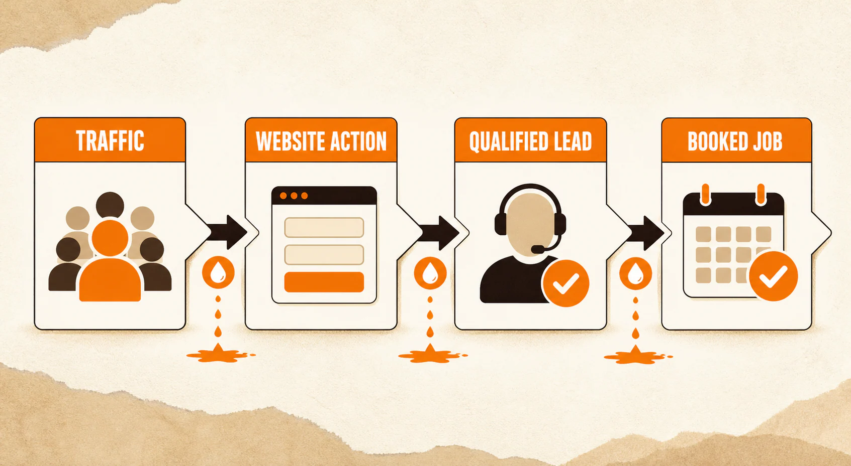
The first leak is important because later improvements can't repair an earlier broken step. A stronger confirmation page does nothing for a form nobody can submit. A faster service page won't solve an ad that sends the wrong audience.
You're ready to make a change when you can name the handoff that appears to fail and point to the observation behind that diagnosis. If you can't do both, keep looking.
4. Fix the Page in Priority Order
Once you've found a plausible leak, make the smallest coherent change that addresses it. "Coherent" matters. You may need to update a headline and the supporting sentence together, for example, because they communicate one message. What you don't want is a grab bag of unrelated edits that leaves you unable to tell what helped.
Make the Service, Audience, Area, and Next Step Obvious
A visitor shouldn't have to investigate your company before learning whether you solve their problem.
At the top of the page, answer four questions in plain language:
- What service do you provide?
- Who is it for?
- Where do you provide it?
- What should the visitor do next?
Skip vague headlines such as "Solutions for a Better Tomorrow." They may sound polished, but they make the reader do the sorting. "Emergency Plumbing in Decatur" is less poetic and far more useful when that's the service being offered.
Then check whether the call to action matches the promise. If the button says "Schedule an Inspection," it should lead to an inspection scheduler or a form that clearly starts that process, not a generic contact page with no explanation.
For a focused homepage review, work through these homepage conversion checks for local businesses instead of guessing at the visible problem.
Reduce Form Friction Without Deleting Useful Qualification
The old advice was often "fewer fields equals more conversions." That's too crude for a service business.
A roofing company may genuinely need a ZIP code and service type before assigning an estimate. An attorney may need to collect enough information to screen a matter. Removing those fields could increase submissions and make the intake team's job worse.
The better rule is to ask only for information you need at this stage. Remove fields that serve no current purpose. Keep fields that determine eligibility, routing, safety, or the next step. Explain why you need information when the reason isn't obvious.
The W3C Web Accessibility Initiative's form guidance recommends short, simple forms with useful labels, instructions, validation, and completion feedback. In practical terms, that means every field should have a clear label, errors should say what needs fixing, and the visitor should know whether the form went through.
Test the revised form with a keyboard and on a phone. Submit incomplete information on purpose. You're checking whether a real person can recover from an error, not whether the form looks tidy in the editor.
Make the Call to Action Explain What Happens Next
Button-color folklore is a distraction. The bigger question is whether the call to action sets an accurate expectation.
"Submit" tells the visitor what happens to the form. It says nothing about what happens for them. Depending on the actual process, wording such as "Request My Estimate," "Check Appointment Times," or "Ask About This Service" may be clearer.
Don't overpromise. If the business will call within one business day, say that near the form. If the request is not a confirmed appointment, don't label it as one. Clarity reduces the little moment of doubt right before action. It also prevents the operations team from inheriting a promise it can't keep.
The completion check is simple: someone unfamiliar with the page should be able to tell what clicking the button will do and what response to expect.
Put Truthful Proof Where Hesitation Happens
Reviews, credentials, licenses, process details, service-area information, and relevant project examples can answer a real concern. They work best near the decision they support.
If prospects hesitate because they don't know whether you serve their neighborhood, add the service area near the CTA. If they worry about what happens inside their home, explain the visit process. If a claim requires a certification, show the current credential rather than a decorative badge nobody can verify.
Testimonials deserve care. The Federal Trade Commission's endorsement guidance says endorsements must be truthful and not misleading, and material connections need disclosure. That's general advertising guidance, not legal advice. The practical takeaway is straightforward: use real reviews accurately, don't edit them into a claim the customer didn't make, and don't present an unusual outcome as typical without appropriate context.
Remove Distractions That Compete With the Main Task
Not every element deserves space just because someone worked hard on it.
Look for sliders, competing buttons, irrelevant offers, auto-playing media, long detours, and overlays that cover the content. If an element doesn't help the visitor understand the service, trust the business, or take the next step, make it earn its spot.
Pop-ups aren't automatically evil, but they shouldn't ambush the primary task. Google's guidance on intrusive dialogs warns that intrusive overlays can frustrate users and obscure content; it recommends less disruptive banners where appropriate. If you test an overlay, make it easy to dismiss and keep the page's normal call to action available.
Treat Performance as a Branch, Not a Convenient Scapegoat
A slow or unstable experience can create friction, especially on mobile. But don't declare speed the cause just because a scoring tool found something to improve.
First reproduce the issue. Does the form shift while someone is trying to tap it? Does the page appear blank for too long on a normal phone connection? Does a third-party scheduler stall? If the problem is real, the PageSpeed Insights improvement guide can help you work through the technical branch.
Verify the actual path again after the fix. A better score is useful; a working contact experience is the point.
5. Test One Change Without Fooling Yourself
The fastest way to ruin a useful test is to change the headline, form, CTA, hero image, page layout, and offer at the same time. Even if the conversion rate moves, you won't know why.
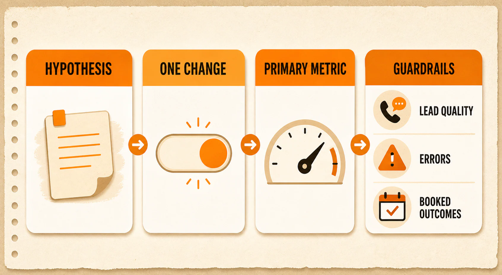
Write a falsifiable hypothesis before the change:
If we clarify the service area beside the quote form, more eligible visitors will submit the form because they can confirm that we serve their location.
Choose one primary metric, such as completed quote requests from comparable service-page sessions. Then choose guardrails, such as qualified-inquiry rate, form errors, booked appointments, and page performance. Set an observation window that accounts for your actual traffic and normal business cycles.
Microsoft's trustworthy experimentation guidance recommends a clear, falsifiable hypothesis and guardrail metrics alongside the main success metric. That's enterprise-level guidance, but the principle scales down nicely: decide what success and accidental damage look like before you see the result.
If you can run a proper A/B test, compare the original and changed experience under controlled conditions. Google notes in its website-testing guidance that the time needed for a reliable test depends on factors including traffic and conversion rate. There is no honest universal sample size or "run it for seven days" rule for every local business.
If you can't get enough traffic for a reliable split test, don't manufacture certainty. Use the low-traffic path below.
You have a usable test plan when the hypothesis names the change and expected mechanism, the primary metric matches the page's job, and the guardrails can catch a worse business outcome.
6. Use a Different Proof Standard When Traffic Is Low
Many local service websites don't produce enough comparable conversions to call a quick winner. One extra form submission can make a monthly rate jump dramatically without proving that the page caused it.
Low traffic doesn't mean you should do nothing. It means you need to separate problem detection from causal proof.
Use repeated checks to find and remove obvious friction:
- Walk through the page and contact path on real mobile and desktop devices.
- Test every phone, form, booking, confirmation, and notification handoff.
- Review form-validation errors and technical error logs.
- Compare inquiry quality before and after the change.
- Note whether qualified inquiries reach an appointment or the next tracked outcome.
- Ask recent prospects what was unclear, while treating their answers as individual feedback rather than a vote from the entire market.
- Compare longer periods with similar seasonality, traffic sources, offers, and operating conditions.
These checks can reveal a broken process or a recurring point of confusion. They may not prove that one page change caused a conversion lift. Say so in the change log. Honest uncertainty is more useful than a fake winner.
7. Keep a Simple Conversion Change Log
Without a record, website optimization turns into office folklore. Somebody remembers that "the old page worked better," but nobody remembers the dates, traffic mix, form issue, or offer change.
Use one row for each meaningful change:
| Field | What to record |
|---|---|
| Page and audience | Exact page and the visitor group it serves |
| Date | When the change went live |
| Hypothesis | The problem, change, and expected mechanism |
| Change | What actually changed and what did not |
| Primary metric | The defined website action and denominator |
| Guardrails | Lead quality, errors, booked outcomes, performance, or another relevant risk |
| Observation window | Dates reviewed and why they are reasonably comparable |
| Decision | Keep, revise, roll back, or continue observing |
| Limitations | Low traffic, seasonality, campaign changes, tracking gaps, or unresolved questions |
Keep it boring. Boring is good here. A clean log prevents the same ideas from being recycled every six months as brand-new insights.
Improve the Handoff Before You Buy the Next Click
None of this means you should stop attracting relevant traffic. Acquisition and conversion work belong together.
But when a website already gets visitors, the smartest next move is often to find the first handoff you can't explain. Define the action. Test the path. Fix the clearest leak. Watch quality as closely as quantity.
Then, when you do invest in more traffic, you're sending it to a path you understand, not one you merely hope works.
For the next pass, use the conversion rate optimization checklist for local businesses to review the rest of the journey without turning the page into another pile of disconnected hacks.
Last updated